introduction:-
Sochain — ek chhoti si dukaan hai. Ek ki deewar peeli hai, signboard hara hai, packaging orange hai aur owner ne sab kuch blindly choose kiya. Doosri dukaan mein sab kuch ek soothe hue color scheme mein hai — navy blue signboard, cream packaging, aur white background. Dono dukanen same cheez bechti hain, same price par. Magar doosri dukaan se zyada log khareedte hain. Kyu?
Jawab hai — Color Basics Se Business Tak ka woh safar jo zyaadatar log kabhi nahi lete. Rangon ki power sirf painting ya design tak simit nahi hai. Yeh aapke business ki pehli impression hai, aapke brand ki awaaz hai, aur aapke customer ke decision ka ek chhupa hua driver hai.
Is article mein hum dekhenge ki Color Basics Se Business Tak ka yeh concept actually kaam kaise karta hai. Chahe aap ek small business owner hon, freelancer hon, blogger hon, ya kisi bhi creative field mein ho — yeh knowledge aapke results ko transform kar sakti hai.
1. Color Basics Se Business Tak — Kyun Yeh Safar Zaroori Hai?

Aaj ki duniya mein competition har field mein hai. Product ya service ki quality akeli kafi nahi hoti. Jab ek customer kisi brand ko dekhta hai toh uska brain pehle 90 seconds mein ek subconscious decision le leta hai — aur us decision mein rang ka hissa 62% se 90% tak hota hai.
Matlab? Color Basics Se Business Tak ki journey sirf ek creative hobby nahi — yeh ek business strategy hai. Bade brands yeh jaante hain. Isliye Coca-Cola ne decades se apna laal rang nahi badla, isliye Amazon ka orange CTA button conversions badhata hai, aur isliye luxury brands black aur gold use karte hain.
Harvard Business Review ki research ke mutabiq: Rang brand recognition ko 80% tak badha sakta hai. Ek sahi rang aapko competitor se alag karta hai bina ek bhi extra rupaya kharch kiye.
Aur yeh sab sirf bade corporations ke liye nahi hai. Ek chai ki tapri se lekar ek Instagram page tak — Color Basics Se Business Tak ki samajh har kisi ko competitive edge deti hai.
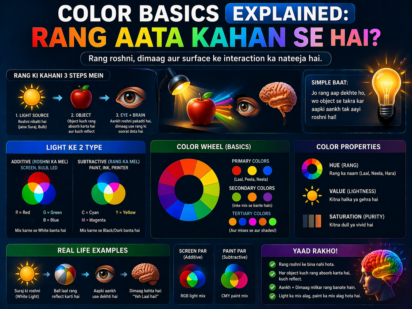
2. Color Basics Ki Neev — Jo Nahi Jaana Toh Kuch Nahi Jaana
Pehle color basics ki foundation samjhte hain kyunki Color Basics Se Business Tak ka safar wahan se hi shuru hota hai.
Color Wheel — Sab Ka Baap
Color wheel ek circular diagram hai jo dikhata hai ki rang ek dusre se kaise related hain. Isme 12 main colors hote hain — 3 primary (laal, peela, neela), 3 secondary (narangi, hara, baingani), aur 6 tertiary (in sab ke combinations).
Primary colors kisi doosre rang ko milakar nahi bante. Secondary colors do primary milaane se bante hain. Tertiary ek primary + ek secondary se.
Hue, Saturation, Value — Rangon Ki Tridevi
Hue = rang ka naam (laal, neela). Saturation = rang ki intensity (bright ya dull). Value = rang ki darkness (light ya dark). Yeh teeno milkar kisi bhi rang ko fully define karte hain.
Warm vs Cool Colors — Emotion Ka Switch
Laal, narangi, peela = warm = energy, excitement, urgency. Neela, hara, baingani = cool = calm, trust, sophistication. Yeh distinction Color Basics Se Business Tak ki journey mein sabse pehle use hoti hai — kisi bhi brand ki emotional positioning ke liye.
Foundation rule: Pehle color basics solid karo — color wheel, 3 properties, warm vs cool. Yeh teen cheezein samajh lo toh business mein rang ka use 10 guna effective ho jaata hai.
3. Brand Color — Aapki Business Ki Khamoshi Bhari Awaaz
Jab koi aapka logo dekhta hai, aapki website visit karta hai, ya aapki packaging unboxing karta hai — rang unhe kuch bata raha hota hai. Yeh baat unhone suni nahi, feel ki hai. Aur feel kiya hua decision logic se zyada powerful hota hai.
Color Basics Se Business Tak ki practical journey mein pehla step hai — apna brand color choose karna. Aur yeh koi random decision nahi hona chahiye.
Brand Color Choose Karne Ka Framework
- Step 1: Apni target audience define karo — unki age, gender, lifestyle, aspirations.
- Step 2: Apne competitors ke colors dekho — alag dikhne ke liye kya available hai?
- Step 3: Apni brand personality decide karo — serious ya playful? Luxurious ya affordable?
- Step 4: Color psychology se match karo — har rang ka ek personality hota hai.
- Step 5: 3-color palette banao — 1 primary brand color, 1 secondary, 1 neutral.
Ek baar brand color set ho jaaye toh use consistently use karo — business cards, social media, packaging, website — sab jagah. Consistency hi recognition banati hai.
4. Color Psychology — Rang Jo Customer Ka Dil Jeette Hain
Color Basics Se Business Tak ki is journey mein color psychology sabse powerful tool hai. Yeh samajhna ki kaunsa rang kya feel karata hai — yeh ek superpower hai jo aapke business decisions ko completely badal deta hai.
Laal (Red) — Urgency Ka Badshah
Laal rang excitement, passion, aur urgency create karta hai. Yeh blood pressure aur heart rate dono badhata hai — scientifically. Isliye sale banners, clearance tags, aur food delivery apps laal use karte hain. Amazon ka ‘Buy Now’ button laal isiliye hai.
Restaurant business mein laal use karo — appetite stimulate karta hai. E-commerce mein laal CTA buttons higher click-through rate dete hain.
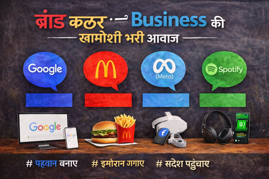
Neela (Blue) — Trust Ka Champion
Neela sabse universally liked color hai — duniya mein sabse zyada logon ka favourite rang neela hai. Yeh trust, reliability, aur calm convey karta hai. Banks, insurance companies, hospitals, aur tech giants — sab blue prefer karte hain.
Facebook, PayPal, Samsung, Dell, HP — sab blue. Agar aap ek trust-based business run karte ho (consulting, finance, healthcare) toh blue aapka best friend hai.
Hara (Green) — Health aur Paise Ka Rang
Hara rang nature, health, growth, aur prosperity se juda hai. Organic food brands, eco-friendly companies, financial institutions — sab green use karte hain. WhatsApp ka green bhi non-threatening aur natural feel deta hai.
Agar aapka product health, wellness, ya sustainability se related hai toh green primary color hona chahiye.
Narangi (Orange) — Energy aur Affordability
Narangi enthusiasm, creativity, aur friendly vibe deta hai. Yeh expensive ya cheap nahi lagta — accessible lagta hai. Amazon ka logo, Swiggy ka orange, Harley-Davidson ka accent color — sab narangi se energy convey karte hain.
Kala (Black) — Luxury Ka Signature
Kala power, sophistication, aur exclusivity ka rang hai. Apple, Chanel, Nike, Rolex — premium brands black dominant use karte hain. Agar aap apne brand ko premium position karna chahte hain, toh black ek strong choice hai.
Color Basics Se Business Tak ka golden insight: Apne brand ka rang decide karne se pehle yeh poochho — jab customer mera rang dekhe, toh mujhe kya feel karana hai? Us feeling se rang choose karo.
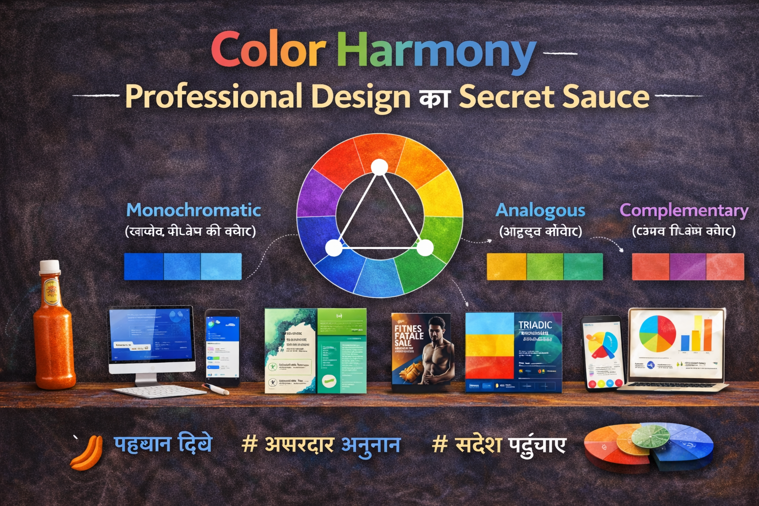
5. Color Harmony — Professional Design Ka Secret Sauce

Sirf ek rang choose karna kaafi nahi. Color Basics Se Business Tak ki journey mein color harmony — yani rangon ka sahi combination — sabse important practical skill hai.
60-30-10 Rule — Designers Ka Brahmastra
Yeh rule interior design, graphic design, web design — har jagah kaam karta hai. 60% dominant color (background, primary spaces), 30% secondary color (text, secondary elements), 10% accent color (CTA buttons, highlights, icons).
Room decor: 60% cream walls, 30% navy blue furniture, 10% gold accents. Website: 60% white background, 30% dark blue text/nav, 10% orange buttons.
Complementary Colors — Bold Statement
Color wheel par opposite rangon ka combination — jaise neela-narangi, laal-hara. Yeh high contrast, bold aur attention-grabbing hota hai. Sale announcements, event posters, sports logos mein zyada use hota hai.
Analogous Colors — Sophisticated Look
Color wheel par paas ke rangon ka combination — jaise navy, teal, sky blue. Yeh natural, harmonious aur elegant lagta hai. High-end brands, spas, wellness companies is combination ko prefer karti hain.
Monochromatic — Timeless Elegance
Ek hi rang ke alag-alag shades, tints, aur tones. Apple ka website mostly monochromatic white hai. Luxury fashion brands monochromatic black use karte hain. Yeh never goes out of style.
Business tip: Agar design mein confident nahi ho toh hamesha monochromatic ya analogous palette se shuru karo. Safe, beautiful, aur professional result guaranteed.
6. Color Basics Se Business Tak — Industry Wise Guide
Har industry ki apni color language hoti hai. Color Basics Se Business Tak ka yeh chapter aapko industry-specific guidance deta hai.
Food & Restaurant Business
Warm colors — laal, narangi, peela — appetite stimulate karte hain aur energy create karte hain. Yeh fast food ke liye ideal hai. Fine dining ke liye deep burgundy, gold, ya dark green — luxury aur sophistication ke liye.
Street food brand: Bold laal + bright yellow. Fine dining: Deep maroon + cream + gold.
Fashion & Clothing Brand
Premium brands — black, white, gold. Youth brands — bright, saturated colors. Sustainable fashion — earth tones, greens, browns. Aapki pricing aur target customer ke hisaab se color palette choose karo.
Rs.500 ka t-shirt brand vs Rs.5000 ka t-shirt brand — dono ke visual identity ka farak sirf packaging aur colors se dikhna chahiye.
Technology & Startup
Blue dominant — trust aur innovation. Purple accent — creativity aur uniqueness. White space ka zyada use — cleanness aur simplicity. Jaise ki Google, Microsoft, Samsung — sab ka primary blue hai lekin secondary colors se differentiation karte hain.
Health & Wellness
Green — natural aur healthy. Light blue — calm aur clean. White — sterile aur pure. Avoid karo — dark, heavy colors jo anxiety create karte hain. Yoga studios, organic brands, hospitals — sab is palette mein comfortable hain.
Education & Coaching
Blue — trust aur knowledge. Green — growth. Orange — enthusiasm aur energy. Combination: Blue + white + orange — professional yet approachable. Zyaadatar ed-tech companies isi palette par kaam karti hain.
Color Basics Se Business Tak ka practical shortcut: Apni industry ke top 5 competitors ke colors dekho. Jo sab use kar rahe hain, woh industry norm hai. Us norm se thoda alag hona hi aapko memorable banata hai.
7. Digital Business Mein Rang — Website, Social Media, Ads
Aaj ke zamane mein business digital hai — aur digital mein color game aur bhi critical ho jaata hai. Color Basics Se Business Tak ki digital application samajhna aaj ke entrepreneur ke liye mandatory hai.
Website Color Strategy
Background color (60%) — mostly white ya very light gray. Navigation aur headings (30%) — brand primary color. CTA Buttons (10%) — contrast mein accent color jo pop kare. Important: Text aur background mein high contrast rakho — readability ka koi substitute nahi hai.
Green CTA buttons se zyada conversions hoti hain ecommerce sites par. Red buttons urgency dete hain. Orange friendly aur energetic feel deta hai. Test karo apni audience ke liye.
Social Media Color Consistency
Instagram, Facebook, LinkedIn — sab par ek consistent color palette maintain karo. Isse brand recognition 80% tak badhti hai. Apne feed ke liye ek template color palette banao aur har post mein usi ko follow karo.
Canva ya Adobe Express mein apna brand color palette save karo. Har graphic mein wahi colors use karo. 3 months mein difference feel hoga.
Advertising Aur Paid Campaigns
Ad mein contrast bahut zaroori hai — agar sab kuch ek tone mein hai toh ad scroll mein dikh hi nahi aayega. Bold background + contrasting text + ek clear CTA button — yeh simple formula ad performance badhata hai.
Facebook ads research: Blue ads pe engagement zyada hota hai B2B mein. Red ads pe impulse purchases zyada hoti hain direct consumer products mein.
8. Packaging aur Offline Business Mein Color Ka Jaadu
Sirf digital nahi — offline world mein bhi Color Basics Se Business Tak ki understanding kaam aati hai. Packaging ek silent salesman hai.
Research kehti hai ki 70% purchasing decisions in-store hoti hain — aur unme se bahut si decisions packaging color se influence hoti hain. Ek product jis ki quality same ho, agar packaging attractive rang mein ho, toh woh zyada bikta hai.
Packaging Color Tips
- Premium product: Matte black ya navy blue packaging — luxurious feel.
- Natural/Organic product: Kraft brown, off-white, sage green — authentic aur natural feel.
- Children’s product: Bright primary colors — red, yellow, blue — attention-grabbing aur playful.
- Tech gadget: Sleek silver, white ya space gray — modern aur innovative feel.
- Beauty product: Rose gold, lavender, blush — feminine aur aspirational feel.
Amazon Best Seller analyze karo apni category mein — dekho unki packaging ka dominant color kya hai. Yeh market research ka sabse fast tarika hai.
9. Color Mistakes Jo Business Ko Nuksaan Pahuchate Hain
Color Basics Se Business Tak ke is safar mein kuch galtiyan aisi hain jo directly revenue ko affect karti hain. Inhe jaanna bahut zaroori hai:
Trendy colors blindly copy karna: Jo rang aaj trendy hai, woh 2 saal mein outdated ho sakta hai. Brand identity consistency ke liye evergreen colors prefer karo.
Target audience ignore karna: 60+ age group ke liye designed product neon colors mein — complete mismatch. Audience ke preference ko samjho.
Cultural context bhoolna: Bharat mein safed mourning ka rang hai kuch regions mein. International brand hain toh global color meanings research karo.
Low contrast text: Light grey text on white background — na padhne wali website bounce rate badhati hai directly.
Too many colors: 5 se zyada colors ek brand identity mein = confusion. Maximum 3 colors stick karo.
Screen vs print ignore karna: RGB (screen) aur CMYK (print) mein same rang alag dikhta hai. Design karte waqt medium consider karo.
Color Basics Se Business Tak mein sabse expensive mistake hai inconsistency — alag jagah alag colors use karna. Brand identity tabhi banti hai jab rang consistent ho.
10. Real Indian Brands Jo Color Se Success Mein Aaye
Theory ko real examples se samajhna sabse best hota hai. Chaliye kuch Indian context mein dekhte hain:
Amul — Laal, Safed, Neela
Amul ki iconic girl aur uski polka-dot dress — laal, safed, neela. Yeh colors simplicity, freshness, aur reliability convey karte hain. Decades se consistent — isliye ek 5 saal ka baccha bhi Amul pehchaan leta hai.
Zomato — Laal
Zomato ka bold laal rang exactly wahi karta hai jo chahiye — appetite stimulate karna aur urgency create karna (order karo, jaldi karo!). Yeh food delivery business ke liye perfect color choice hai.
Paytm — Neela
Finance aur payments mein trust sabse zaroori hai. Paytm ka neela rang exactly yahi communicate karta hai — safe, reliable, aur trustworthy. Color choice aur brand positioning perfectly aligned.
Paper Boat — Earthly, Nostalgic Tones
Paper Boat drinks ki packaging mein warm earth tones, vintage-feel colors hain jo nostalgia evoke karte hain — bachpan ki yaad. Yeh deliberate color strategy hai jo premium pricing ko justify karti hai.
Lesson: Yeh sab brands koi accident nahi hai. Color Basics Se Business Tak ki deep understanding ke saath deliberately har rang choose kiya gaya hai.
11. Practical Action Plan — Aaj Se Hi Shuru Karo
Itna padhne ke baad agar action nahi liya toh kuch faida nahi. Color Basics Se Business Tak ki journey ke liye yeh concrete steps aaj hi uthao:
Week 1: Audit Karo
- Apne current business ke sab colors ek jagah collect karo — logo, website, packaging, social media.
- Puchho — kya yeh sab consistent hain? Kya yeh meri target audience ko suit karte hain?
- Competitors ke colors note karo — kahan aap similar ho, kahan alag.
Week 2: Plan Karo
- 3-color palette decide karo: 1 primary brand color + 1 secondary + 1 neutral.
- Color psychology se verify karo — kya yeh colors aapki brand personality convey karte hain?
- Adobe Color ya Coolors.co par palette save karo.
Week 3-4: Implement Karo
- Logo update karo agar zaroori ho.
- Social media templates naye colors mein banao — Canva mein free hota hai.
- Website ke CTA buttons aur headings update karo.
- Packaging ya visiting card hain toh next print run mein update karo.
100% perfect hone ka wait mat karo. 80% sahi color strategy consistently implement karna, 100% perfect strategy jo kabhi implement na ho usse behtar hai.
12. Color Basics Se Business Tak — Agle Level Par Kaise Jaayein?
Aapne Color Basics Se Business Tak ki poori journey cover kar li. Ab aage badhne ke liye kuch aur steps:
Sikhne Ke Resources
- Adobe Color (color.adobe.com) — Free color palette tool, industry standard.
- Coolors.co — Quick palette generation, export in multiple formats.
- Canva Color Wheel — Visual aur interactive, beginners ke liye best.
- Google’s Material Design Color Tool — Web aur app design ke liye perfect.
- Brand Style Guide banao — apne sabhi brand colors, fonts, rules document karo.
Advanced Learning
Ek baar color basics aur business application solid ho jaaye, toh aage yeh topics explore karo: Typography aur Color ka relationship, Color in UX/UI Design, A/B testing with colors (kaunsa button color zyada convert karta hai), aur Video color grading.
Mindset Shift
Sabse important cheez: Ab jab bhi koi brand, packaging, ya design dekho — rang ko analyze karo. Kyun yeh rang choose kiya hoga? Kya feel ho raha hai? Kya target audience ke liye sahi hai? Yeh daily habit Color Basics Se Business Tak ki journey ko accelerate kar degi.
Final thought: Rang sirf sunder dikhne ke liye nahi hota — rang kaam karta hai. Rang trust banata hai, emotion create karta hai, aur decision influence karta hai. Color Basics Se Business Tak ka safar start karna matlab hai apne business ko ek unfair advantage dena.
Conclusion — Rang Mein Hai Rozgar
Is article mein humne dekha ki Color Basics Se Business Tak ka safar sirf creativity ka nahi, strategy ka bhi hai. Ek sahi rang aapki brand ki pehchaan bana sakta hai, customer ka trust jeet sakta hai, aur ultimately aapke business ki growth mein directly contribute kar sakta hai.
Color basics jaanna aur use business mein apply karna — yeh aaj ke competitive market mein ek non-negotiable skill hai. Bade brands iske liye lakhs kharach karte hain. Aapko unse yeh edge mil gayi hai sirf is article padhne se.
Ab action ki baari hai. Aaj apne business ke colors dekho, audit karo, aur planning shuru karo. Yaad rakho — Color Basics Se Business Tak ka yeh safar chhoti si shuruwat se hi hota hai.
Agar aapko yeh article helpful laga toh apne entrepreneur dosto aur creative friends ke saath zaroor share karo. Comment mein batao — aapke business ka main color kya hai aur kyun? Hum padhenge aur reply karenge!