
introduction:-
Ek baar socho — aapke paas ek amazing idea hai ek logo ke liye, ek poster ke liye, ya apni kisi project ke liye. Aap kaam shuru karte ho magar jab result dekhhte ho toh kuch missing lagta hai. Design technically sahi hai, content bhi theek hai, magar phir bhi wow factor nahi hai. Pata hai kyun?
Kyunki rang theek nahi the. Aur yeh ek bahut common problem hai un logon mein jo From Zero to Pro ka safar shuru karna chahte hain lekin color basics ki foundation solid nahi hoti.
Yeh article usi gap ko bharne ke liye likha gaya hai. Yahan aap sikhenge woh sab kuch jo ek beginner se lekar ek professional designer tak ka safar — From Zero to Pro — require karta hai color theory mein. Simple language mein, practical examples ke saath, aur bina kisi boring lecture ke. Toh chaliye seedha kaam ki baat karte hain.
1. From Zero to Pro Ka Pehla Qadam — Color Kyun Seekhna Zaroori Hai?

Bahut saare log design seekhne mein sirf tools par focus karte hain — Photoshop, Illustrator, Canva. Tools seekhna zaroori hai, magar tools sirf haath hain. Sochna aur samajhna toh dimaag ka kaam hai. Aur dimaag ko sikhata hai color theory.
From Zero to Pro ka matlab sirf software expert banana nahi hai — iska matlab hai ek aisi design sensibility develop karna jo kisi bhi tool par, kisi bhi platform par, kisi bhi project par kaam kare. Aur yeh sensibility color se shuru hoti hai.
Ek survey ke mutabiq: 85% consumers kehte hain ki rang unhe kisi brand ka product kharidne ke liye persuade karta hai. Designer ke liye color ek creative choice nahi — ek strategic weapon hai.
Jab aap color basics samjh lete ho, toh aap sirf rang nahi chunte — aap emotion, message, aur impact choose karte ho. Yahi From Zero to Pro transition ka sabse pehla aur sabse important step hai.
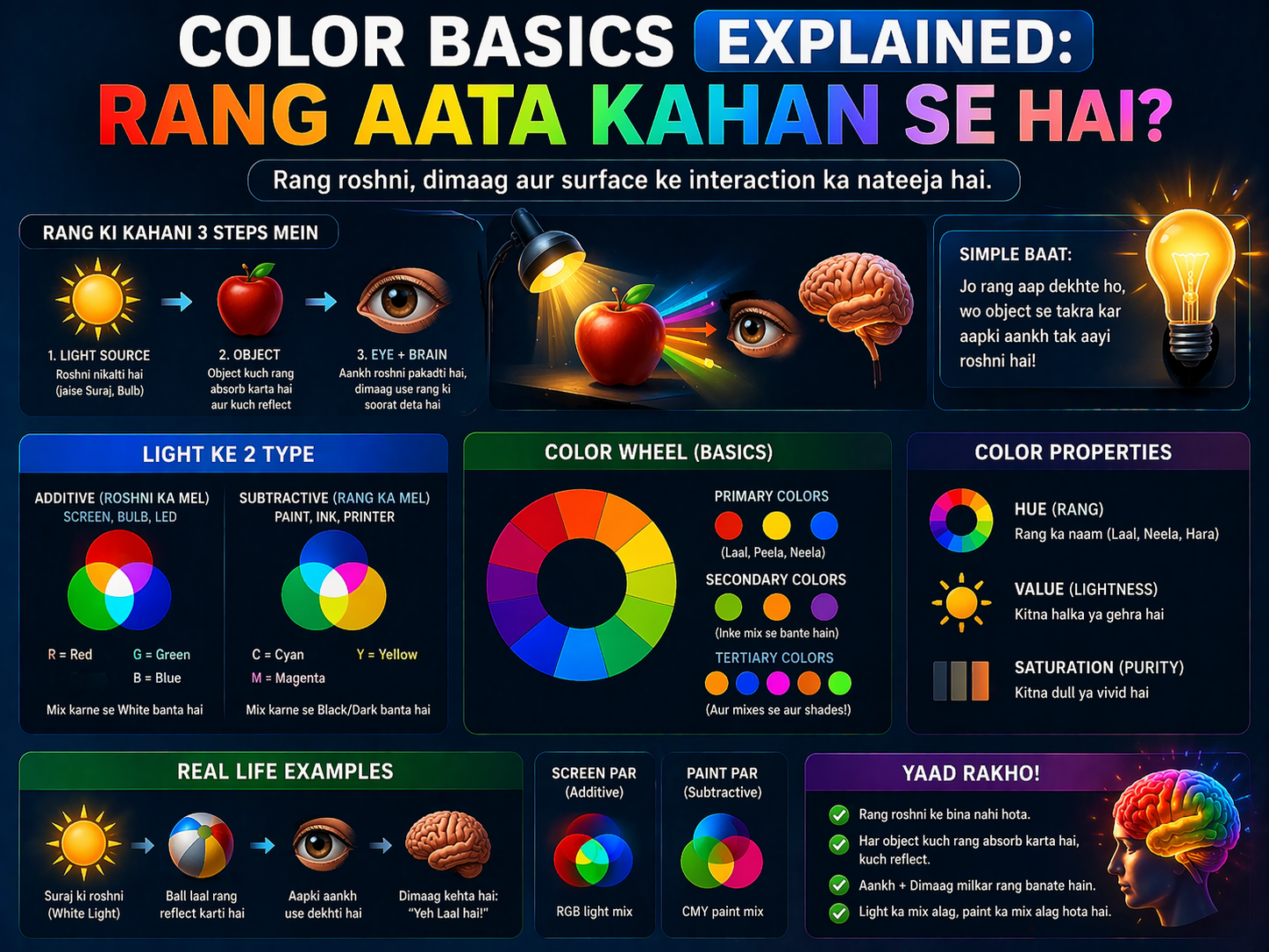
2. Rang Ka Asli Vigyan — Light, Eyes, aur Brain Ka Khel
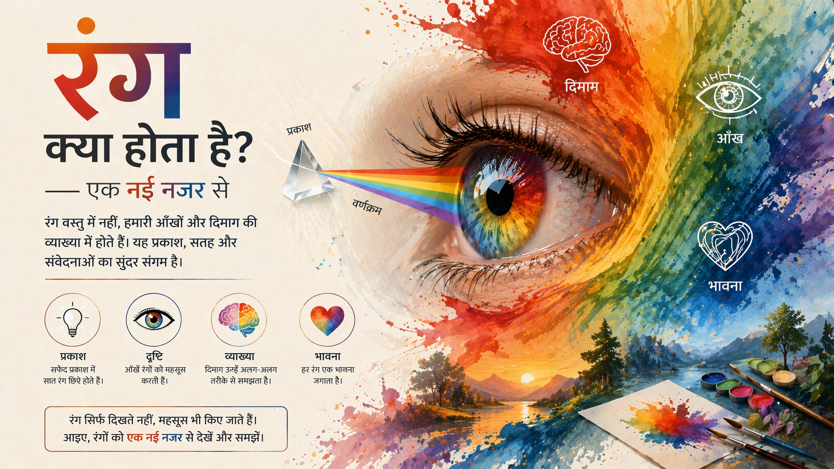
From Zero to Pro banne ke liye yeh jaanna zaroori hai ki rang hota kya hai. Aur jawab thoda surprising hai — rang bahar nahi hota, rang aapke dimaag mein banta hai.
Jab light kisi object par padti hai, woh object kuch wavelengths absorb karta hai aur kuch reflect karta hai. Jo wavelength reflect hoti hai woh aapki aankhon ke retina mein maujood cones tak pahuchti hai. Yeh cones brain ko signal bhejte hain. Brain us signal ko process karke ‘rang’ create karta hai.
Insaan ki aankh lagbhag 10 million alag-alag rang distinguish kar sakti hai. Magar cameras aur screens isse bahut kam capture karte hain — isliye photo aur reality mein rang ka farak lagta hai.
Practical designer ke liye iska matlab yeh hai: rang ek fixed reality nahi hai. Surrounding lighting, background color, aur screen calibration — sab rang ke appearance ko badal dete hain. From Zero to Pro banne ke liye yeh contextual samajh bahut zaroori hai.
Ek hi rang dark background par alag dikhta hai, light background par alag. Simultaneous contrast ka yeh illusion design mein bahut kaam aata hai — depth aur vibrancy create karne ke liye.
3. Color Wheel — From Zero to Pro Ka Sabse Pehla Tool
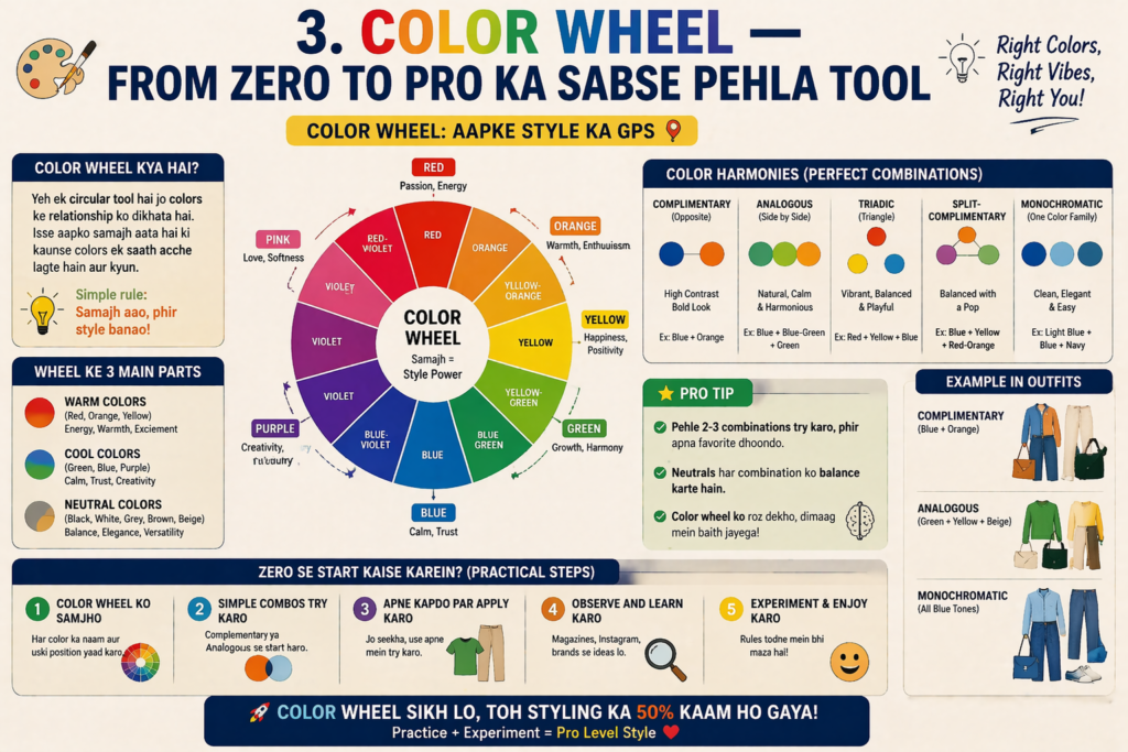
Agar design ki duniya mein ek cheez hai jo From Zero to Pro ke safar mein sabse pehle master karni chahiye, toh woh hai color wheel. Yeh ek simple circular chart hai jo dikhata hai ki rang kaise related hain — aur iski samajh se professional color combinations banana bahut aasaan ho jaata hai.
Primary Colors — Teen Mool Rang
Laal (Red), Peela (Yellow), aur Neela (Blue) — yeh teeno primary colors hain. Inhe kisi aur rang ko milaakar nahi banaya ja sakta. Yeh rangon ki duniya ke ancestors hain. Har doosra rang inheen teeno ka combination hai.
Secondary Colors — Milane Ka Jaadu
Jab do primary colors milte hain toh secondary colors bante hain. Laal + Peela = Narangi. Peela + Neela = Hara. Neela + Laal = Baingani. Yeh teeno color wheel par primary colors ke beech mein hote hain.
Tertiary Colors — Rangon Ka Ek Aur Parivaar
Ek primary aur uske saath wale secondary ko milaakar tertiary colors bante hain. Red-Orange, Yellow-Green, Blue-Violet — yeh sab tertiary hain. Color wheel mein total 12 colors hote hain.
Complementary, Analogous, Triadic
Color wheel ka asli magic hai yeh samajhna ki rangon ke beech kya rishta hai. Complementary colors wheel par seedhe opposite hote hain — bold contrast dete hain. Analogous colors paas-paas hote hain — natural aur harmonious lagta hai. Triadic colors wheel par ek triangle banate hain — vibrant aur balanced combination.
From Zero to Pro shortcut: Color wheel ko ek baar print karke apni desk par rakh lo. Jab bhi color combination select karna ho, wheel dekho. Yeh simple habit professional results dena shuru kar deti hai.
4. Hue, Saturation, Value — Rang Ki Tridevi
From Zero to Pro ke is chapter mein hum teeno properties samjhenge jo kisi bhi rang ko completely describe karti hain. Ek baar yeh samajh aa jaaye, toh koi bhi color software — Photoshop, Illustrator, ya Procreate — ek open book ban jaata hai.
Hue — Rang Ki Identity
Hue simply rang ka naam hai — laal, peela, neela, hara. Jab hum color wheel ke baare mein baat karte hain, toh hum basically hue ki baat kar rahe hote hain. Yeh sabse basic level par rang ki identification hai. Ek designer ke liye sahi hue choose karna brand identity ka foundation hai.
Saturation — Rang Ki Shakti
Saturation yeh batata hai ki rang kitna pure aur intense hai. 100% saturation = ek bilkul vivid, pure, popped rang. 0% saturation = gray. Ek beach sunset photo mein orange bahut saturated hoga — deep, glowing. Ek foggy morning ki photo mein sab kuch desaturated, muted lagega.
Portrait photography mein thoda desaturated skin tones professional aur cinematic lagte hain. Fully saturated skin tones amateurish lagte hain. Saturation control hi yeh fark banata hai.
Value — Rang Ki Roshni
Value ya brightness batata hai rang kitna light ya dark hai. Tint = rang mein white milana (lighter value). Shade = rang mein black milana (darker value). From Zero to Pro banne mein value ko control karna seekhna bahut zaroori hai kyunki value hi depth, dimension, aur contrast create karta hai.
Pro tip: Agar aapka design black-and-white mein bhi readable hai, toh aapne value contrast sahi use kiya hai. Yeh ek professional designer ka basic test hai.
5. Warm aur Cool Colors — Emotion Ko Design Karo

From Zero to Pro ke is phase mein hum colors ko feel karna seekhte hain — sirf dekhna nahi. Rang emotion se seedha connected hai. Aur yeh connection subconscious hai — logo ko realize bhi nahi hota ki rang unhe kaise feel kara raha hai.
Warm Colors — Energy Ka Source
Laal, narangi, peela — yeh warm colors hain. Yeh energy, excitement, warmth, aur passion evoke karte hain. Fire, sunlight, heat — sab warm colors se represent hote hain. Marketing mein urgency create karne ke liye, food industry mein appetite trigger karne ke liye, aur youth brands mein energy convey karne ke liye warm colors dominant hote hain.
Duniya ke top fast food chains — McDonald’s, KFC, Burger King, Domino’s — sab red ya red-yellow combination use karte hain. Yeh accidental nahi hai.
Cool Colors — Calm Ka Sensation
Neela, hara, baingani — yeh cool colors hain. Yeh trust, calm, reliability, aur professionalism convey karte hain. Sky, ocean, forests — sab cool colors se associated hain. Tech companies, healthcare, finance — sab cool colors prefer karte hain kyunki yeh stability aur trustworthiness ka signal dete hain.
WhatsApp, Facebook, Twitter, LinkedIn, PayPal — sab ka primary color blue hai. Trust aur reliability ek shared language hai.
Neutral Colors — Unsung Heroes
Kala, safed, gray, beige, brown — yeh neutral colors hain. Yeh loud nahi hote, magar design mein backbone ki tarah kaam karte hain. 60-30-10 rule mein — 60% space aksar neutral hi hota hai. Neutrals doosre rangon ko breathe karne dete hain aur overall composition ko balance karte hain.
From Zero to Pro ka emotional design rule: Pehle decide karo aapke design ko viewer ko kaise feel karana hai. Uske baad warm ya cool choose karo. Feeling pehle, rang baad mein.
6. Color Harmony — Sahi Combination Ka Fann
Ek professional designer aur ek beginner mein sabse bada fark hota hai color harmony ki samajh. From Zero to Pro banne ka matlab hai yeh jaanna ki kaunsa rang kaunse rang ke saath acha lagta hai — aur kyun.
Complementary Harmony — Maximum Contrast
Color wheel par seedhe opposite rangon ka use. Laal-Hara, Neela-Narangi, Peela-Baingani. Yeh combination bold, energetic aur high-visibility hota hai. Sports logos, sale banners, warning signs — sab complementary harmony use karte hain. Caution: Yeh thoda aggressive ho sakta hai, isliye ek dominant rang rakho doosra accent mein.
Analogous Harmony — Natural Feel
Wheel par paas ke 3-4 rang. Jaise laal, laal-narangi, narangi. Ya neela, neela-green, green. Yeh combination nature mein bahut common hai — isliye natural aur comfortable lagta hai. Wellness brands, lifestyle blogs, interior design — sab analogous harmony prefer karte hain.
Triadic Harmony — Vibrant Balance
Wheel par ek equilateral triangle ke teen corners ke rang. Laal, Peela, Neela ya Narangi, Hara, Baingani. Yeh vibrant aur balanced dono ek saath hota hai. Children’s brands, creative agencies, entertainment companies yeh use karte hain.
Split Complementary — Safe Contrast
Ek rang + uske complementary rang ke dono taraf ke rang. Complementary se thoda soft. Beginners ke liye yeh best starting point hai kyunki contrast bhi hai aur aggression nahi.
Monochromatic — Timeless Class
Ek hi hue ke alag shades, tints, aur tones. Apple ka website is ka best example hai. Elegant, sophisticated, aur timeless. Kisi bhi industry mein safe aur professional choice.
From Zero to Pro rule: Jab tak confident na ho, monochromatic ya analogous palette use karo. Jab color confidence aa jaaye, complementary aur triadic explore karo.
7. Color Psychology — Dimaag Ke Button Kaise Dabaate Hain Rang?
From Zero to Pro ki journey mein color psychology ek master skill hai. Yeh samajhna ki rang human behavior ko kaise influence karta hai — yeh sirf designers ke liye nahi, balki marketers, entrepreneurs, aur content creators sabke liye game-changing knowledge hai.
Laal: Urgency, passion, energy, appetite. Use case: Sale signs, CTA buttons, food brands, warning labels.
Narangi: Enthusiasm, creativity, fun, friendliness. Use case: Youth brands, food delivery, call-to-action.
Peela: Optimism, clarity, warmth, attention. Use case: Children’s products, caution signs, summer brands.
Hara: Nature, growth, health, wealth. Use case: Organic brands, finance apps, wellness products.
Neela: Trust, calm, intelligence, professionalism. Use case: Banks, tech companies, healthcare, social media.
Baingani: Luxury, mystery, creativity, wisdom. Use case: Premium brands, beauty, spirituality, anti-aging.
Pink: Love, femininity, sweetness, playfulness. Use case: Romance brands, beauty, confectionery, fashion.
Kala: Power, elegance, mystery, sophistication. Use case: Luxury fashion, premium tech, high-end services.
Safed: Purity, cleanliness, simplicity, space. Use case: Healthcare, minimal brands, tech, wedding industry.
Yeh knowledge From Zero to Pro transition ka ek critical milestone hai. Jab aap ek design brief padhte ho aur seedha samajh jaate ho ki kaunsa rang zarurat hai — woh moment jab aap genuinely professional lane pe aa jaate ho.
8. Tints, Shades, aur Tones — Ek Rang Ke Sau Chehra
Bahut saare beginners yeh sochte hain ki rang sirf kuch hi hote hain — laal matlab laal, neela matlab neela. Magar From Zero to Pro banne ke liye yeh samajhna zaroori hai ki ek akele rang mein infinite variations hoti hain.
Tint — Rang + Safed
Jab hum kisi rang mein white milate hain toh uska tint banta hai. Laal ka tint = Pink. Neela ka tint = Baby Blue. Baingani ka tint = Lavender. Tints softer, lighter, aur more approachable lagte hain. Baby products, feminine brands, aur spring-themed designs mein tints dominant hote hain.
Shade — Rang + Kala
Jab rang mein black milate hain toh shade banta hai. Laal ka shade = Maroon ya Burgundy. Neela ka shade = Navy. Hara ka shade = Forest Green. Shades deeper, more serious, aur premium lagte hain. Luxury brands, autumn themes, aur professional designs mein shades zyada use hote hain.
Tone — Rang + Gray
Jab rang mein gray milate hain toh tone banta hai. Tones muted, sophisticated, aur natural lagte hain. High-end interior design, premium fashion brands, aur editorial photography mein tones bahut common hain. Yeh From Zero to Pro designers ka secret weapon hai — pure saturated colors se alag ek matured palette.
Designer ka test: Sirf ek base color lo — neela maan lo. Iske tints, shades, aur tones milaakar ek complete palette banao. Yeh exercise From Zero to Pro journey mein color confidence banane ka sabse fast tarika hai.
9. Digital Colors — RGB, CMYK, HEX aur Color Spaces
From Zero to Pro ka matlab sirf artistic knowledge nahi — technical knowledge bhi hai. Digital design mein colors ek specific technical system pe kaam karte hain jo samajhna bahut zaroori hai.
RGB — Screen Ki Duniya
RGB = Red, Green, Blue. Har screen — phone, laptop, TV — RGB model use karta hai. In teeno light channels ki values 0 se 255 tak hoti hain. Teeno 255 = pure white. Teeno 0 = pure black. Web design, app design, social media graphics — sab RGB mein work karo.
Pure red: R=255, G=0, B=0. Pure green: R=0, G=255, B=0. Pure yellow: R=255, G=255, B=0. Screen par check karo.
CMYK — Print Ki Duniya
CMYK = Cyan, Magenta, Yellow, Key (Black). Printing press yeh 4 inks use karta hai. Jab aap koi brochure, packaging, ya poster print karate ho — design CMYK mein hona chahiye. Screen par designed RGB colors print mein alag dikh sakte hain.
From Zero to Pro rule: Screen ke liye RGB, print ke liye CMYK. Galat mode mein kaam karna = alag result print hona = client complaint = unprofessional image.
HEX Codes — Web Designer Ka Password
HEX codes 6-digit alphanumeric codes hain jo web par colors represent karte hain. #FF0000 = Red. #0000FF = Blue. #FFFFFF = White. #000000 = Black. CSS aur HTML mein colors hamesha HEX ya RGB values se define kiye jaate hain.
HSL — Designer Ka Intuitive System
HSL = Hue, Saturation, Lightness. Yeh system designers ke liye zyada intuitive hai kyunki directly hue (rang), saturation (intensity), aur lightness (brightness) adjust kar sakte ho bina complex number yaad kiye.
From Zero to Pro technical rule: Har project start karne se pehle decide karo — kya yeh screen ke liye hai ya print ke liye? Us hisaab se sahi color mode set karo. Yeh basic step bahut saari problems prevent karta hai.
10. Color Contrast — Readability Ka Raaz
From Zero to Pro banne mein ek bahut important lekin aksar ignore hone wali skill hai — color contrast ka sahi use. Beautiful colors choose karna ek baat hai, magar agar text padhne mein mushkil ho toh design fail hai.
Contrast Kyun Zaroori Hai?
Web Accessibility Guidelines (WCAG) kehte hain ki normal text ka background se contrast ratio kam se kam 4.5:1 hona chahiye. Simple terms mein: light background par dark text, dark background par light text. Yeh sirf accessibility ke liye nahi — yeh basic readability ke liye bhi hai.Light gray text on white background — beautiful lagta hai magar padhna impossible. Bahut se beginner yeh mistake karte hain.
Dark navy ya black text on white/cream background — classic, professional, perfectly readable.
Contrast Kaise Check Karein
WebAIM Contrast Checker (webaim.org/resources/contrastchecker) ek free tool hai jahan aap apne text aur background colors ka contrast ratio check kar sakte ho. From Zero to Pro designers yeh hamesha use karte hain before finalizing any design.
Contrast Aur Visual Hierarchy
Sirf text nahi — contrast pura visual hierarchy create karta hai. Sabse important element sabse high contrast mein hona chahiye. CTA button background se pop karta hai isliye zyada contrast mein hota hai. Secondary elements lower contrast mein hote hain taaki hierarchy clear ho.
From Zero to Pro contrast rule: Agar aap design squint karke dekhte ho aur important elements blur mein bhi differentiate ho jaate hain — contrast sahi hai. Yeh quick test professional designers use karte hain.
11. Common Color Mistakes — From Zero to Pro Mein Kya Avoid Karein
Sikhne ke saath saath yeh jaanna bhi equally important hai ki kya nahi karna chahiye. Yeh mistakes beginners ko beginners hi rakhti hain:
Mistake 1 — Too Many Colors: Ek design mein 5+ rang = confusion aur chaos. Professional rule: Maximum 3 colors, ideally 2 + 1 neutral.
Mistake 2 — Low Contrast Text: Light gray on white, yellow on white — yeh common mistakes hain jo readability destroy karti hain.
Mistake 3 — Trendy Colors Without Strategy: Jis rang ka trend chal raha hai woh blindly use karna. Trend 6 mahine baad khatam, brand identify stuck.
Mistake 4 — Ignoring Color Context: Ek rang alag backgrounds par alag dikhta hai. Isolate karke color decide mat karo, final context mein test karo.
Mistake 5 — RGB vs CMYK Confusion: Screen design CMYK mein ya print design RGB mein — yeh bahut common expensive mistake hai.
Mistake 6 — Ignoring Colorblindness: 8% mard partially colorblind hote hain. Red-green combinations akele mat use karo critical information ke liye.
Solution for all: 60-30-10 rule follow karo. 60% dominant neutral, 30% primary brand color, 10% accent. Contrast check karo. RGB/CMYK confirm karo.
From Zero to Pro ka mindset shift: Beginners rang use karte hain kyunki unhe acha lagta hai. Professionals rang use karte hain kyunki woh kaam karta hai. Dono mein yeh fark hai.
12. From Zero to Pro Ka Complete Action Plan — Aaj Se Shuru Karo
Theory padhna ek baat hai, professionally apply karna dusri. From Zero to Pro banne ke liye yeh structured action plan follow karo:
Stage 1 — Zero (Week 1-2): Foundation
- Color wheel print karke desk par rakho — primary, secondary, tertiary samjho.
- Hue, Saturation, Value — kisi bhi color picker (Photoshop/Canva) mein yeh teeno manually adjust karke dekho.
- Apne 5 favorite brands ke colors note karo aur color psychology se match karo.
Stage 2 — Beginner (Week 3-4): Application
- Adobe Color ya Coolors.co par roz ek naya color palette banao — complementary, analogous, triadic.
- Ek simple social media post design karo sirf 2 colors + 1 neutral use karke.
- WebAIM Contrast Checker par apne designs ka contrast check karo.
Stage 3 — Intermediate (Month 2): Confidence
- 60-30-10 rule use karke ek complete brand color guide banao — kisi bhi fictional brand ke liye.
- RGB aur CMYK dono mein ek poster design karo aur difference notice karo.
- 3 real designs analyze karo — kyun unke rang kaam karte hain ya nahi karte.
Stage 4 — Pro (Month 3+): Mastery
- Khud ke liye ek personal brand color palette banao — logo se lekar social media templates tak.
- Client projects mein color recommendations ek brief ke saath present karo — sirf design nahi, rationale bhi.
- Har design mein mood board se shuru karo — pehle feel decide karo, rang baad mein.
From Zero to Pro ka sabse important rule: Roz ek design karo. Chhoti practice badi theoretical reading se zyada seekhati hai. Consistency beats perfection.
Free Resources Jo From Zero to Pro Journey Mein Help Karein: • Adobe Color — color.adobe.com • Coolors — coolors.co • WebAIM Contrast Checker — webaim.org • Canva Color Wheel — canva.com/colors/color-wheel • Dribbble — color palettes ke real examples ke liye
Conclusion — Ab Aap Zero Nahi Rhe
Is article ko padhne ke baad ek cheez confirm hai — aap already From Zero to Pro ki journey ke pehle aur sabse important step le chuke hain. Color basics ko seriously lena aur unhe samajhna — yeh woh foundation hai jis par ek professional design career tika hota hai.
Yaad rakho — har bada designer bhi kabhi beginner tha. Fark sirf itna hai ki unhone color theory ko seriously liya, roz practice ki, aur apni mistakes se seekha. From Zero to Pro ka yeh safar time leta hai, magar yeh possible hai — har kisi ke liye.
Ab aapke paas knowledge hai. Ab bas ek kaam baaki hai — action lena. Aaj hi ek color palette banao, ek design try karo, ek brand ke rang analyze karo. Chhota step, magar bahut bada result.
Agar yeh article aapke kaam aaya, toh apne designer dost ya creative group mein share zaroor karo. Aur comment mein batao — From Zero to Pro ki aapki journey mein color ka sabse bada challenge kya hai? Hum milke solve karenge!