Rang Ki Duniya Mein Aapka Swagat Hai
Kya aapne kabhi socha hai ki ek simple painting, ek advertisement, ya ek website itni attractive kyun lagti hai? Iska jawab chhupa hota hai rang ke samjh mein. Color Basics 101 woh foundation hai jiske upar poori duniya ki visual creativity khadi hai. Chahe aap ek designer ho, artist ho, blogger ho, ya sirf apni zindagi ko thoda aur colorful banana chahte ho — rang ki samajh aapko ek alag hi level par le jaati hai.
Aaj is article mein hum Color Basics 101 ko ek bilkul naye, interesting, aur practical andaaz mein samjhenge. Koi boring theory nahi, koi mushkil terms nahi — sirf seedhi, simple, aur kaam ki baatein.
1. Rang Kya Hota Hai? — Ek Nayi Nazar Se

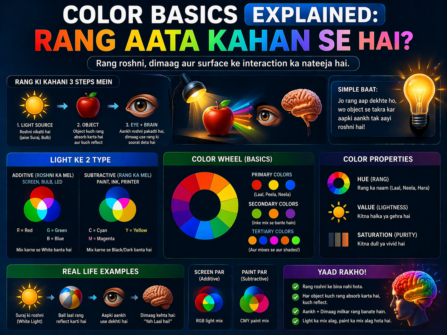
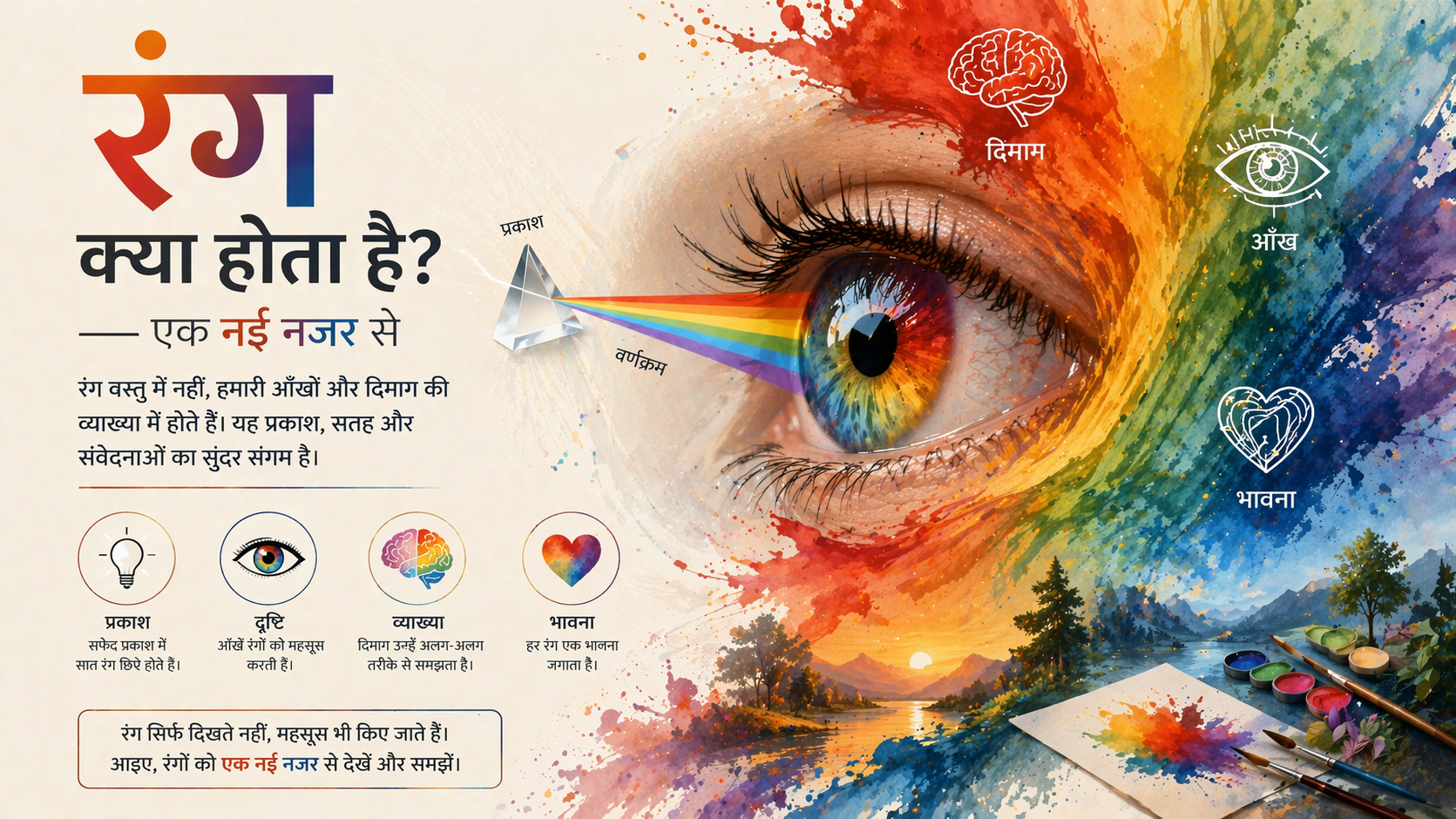
Sabse pehle Color Basics 101 ki neev samajhte hain. Rang aslal mein roshan ki wo wavelength hoti hai jo humari aankhon tak pohonchti hai aur hamare brain mein ek reaction paida karti hai. Jab sooraj ki roshni kisi cheez par padti hai, to kuch wavelengths absorb hoti hain aur kuch reflect hoti hain. Jo reflect hoti hain, wohi hamein rang ke roop mein dikhti hai.
Yaad rakhein: Rang sirf ek visual experience nahi hai — yeh ek emotional aur psychological experience bhi hai.
Isaac Newton ne 1666 mein prism se sunlight ko pass karke prove kiya tha ki white light actually saat rangon ka combination hai. Ye saat rang hain — VIBGYOR — Violet, Indigo, Blue, Green, Yellow, Orange, Red. Yahi Color Basics 101 ka pehla aur sabse important lesson hai.
2. Color Wheel — Rangon Ka Chakkar Jo Sab Kuch Badal De
Color Wheel artist Johannes Itten ne popularize kiya tha aur aaj bhi poori design duniya isko use karti hai. Color Basics 101 seekhte waqt Color Wheel ko samajhna sabse zaroori step hai. Is wheel mein teen categories hoti hain:
Primary Colors — Teen Jadui Rang
Primary colors woh hain jo kisi bhi doosre rang ko milane se nahi bante. Ye hain: Lal (Red), Peela (Yellow), aur Neela (Blue). Ye Color Basics 101 ke sabse basic building blocks hain. Inhe milao aur naye rang banao.
Secondary Colors — Jab Do Milte Hain
Do primary colors ko milane se secondary colors bante hain. Red + Yellow = Orange. Yellow + Blue = Green. Blue + Red = Purple. Yeh mixing process Color Basics 101 ki sabse interesting part hai.
Tertiary Colors — Aur Gehraai Mein
Primary aur secondary ko milane se tertiary colors bante hain jaise Red-Orange, Yellow-Green, Blue-Violet etc. Isse aapko 12 colors ka ek complete Color Wheel milta hai jo design mein kaafi kaam aata hai.
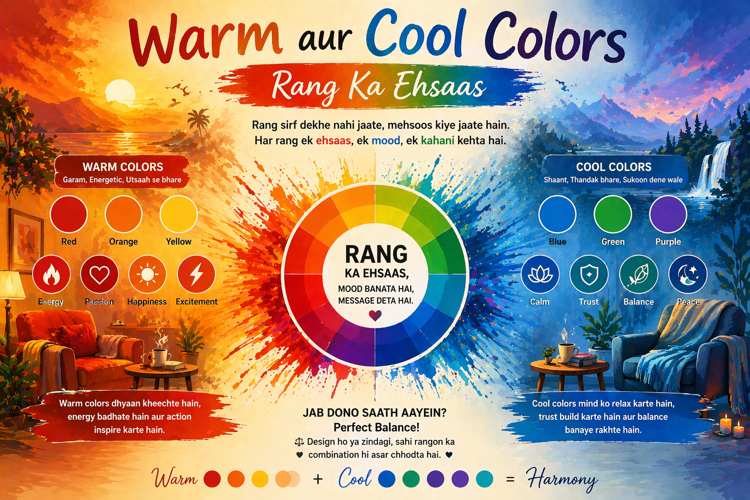
3. Warm vs Cool Colors — Emotions Ka Khel
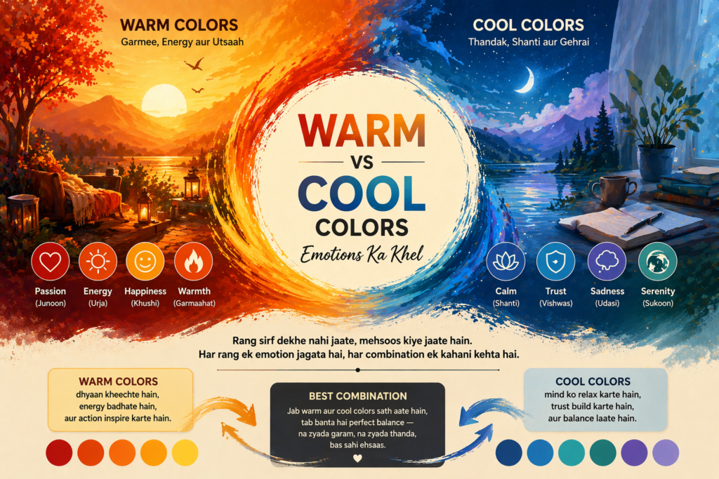
Color Basics 101 mein ek bahut important concept hai colors ka emotional impact. Rangon ko do main categories mein baanta jaata hai:
Warm Colors — Garmi, Jazba, Urja
Lal, naranja (orange), aur peela — ye sab warm colors hain. Ye rang energy, passion, excitement, aur warmth ka ehsaas dete hain. Kisi bhi advertisement mein jab action ya urgency chahiye hoti hai to ye rang use kiye jaate hain. Restaurants mein aksar lal aur orange use hota hai kyunki ye bhookh badhate hain — yeh ek scientifically proven fact hai.
Cool Colors — Sukoon, Vishwas, Gehraai
Neela, hara, aur violet — ye cool colors hain. Ye shanti, vishwas, aur professionalism ka ehsaas dete hain. Isliye hospitals, banks, aur tech companies zyaada neele rang ka use karti hain. Color Basics 101 ka yeh concept marketing aur branding mein game-changer hai.
4. Tints, Tones, aur Shades — Rangon Ki Gehraai
Color Basics 101 ka ek aur advanced lekin zaroori concept hai — ek hi rang ke alag alag versions. Sirf ‘neela’ kehna kaafi nahi — neele ke bhi hazaron roop hote hain.
Tint — Roshni Ka Sparsh
Jab kisi rang mein safed (white) milate hain to tint banta hai. Jaise lal mein white milane se pink ban jaata hai. Tints zyaada soft aur light lagte hain.
Shade — Andheron Ki Gehraai
Jab kisi rang mein kaala (black) milate hain to shade banta hai. Lal mein black milane se dark red ya maroon ban jaata hai. Shades zyaada dramatic aur powerful lagte hain.
Tone — Balance Ka Raasta
Gray milane se tone banta hai. Tones bahut sophisticated aur muted lagte hain — professional design mein inhe bahut use kiya jaata hai. Color Basics 101 mein tints, shades, aur tones ka concept samajhna aapko ek real artist banata hai.
5. Color Harmony — Jab Rang Milkar Gaate Hain
Color Basics 101 ka sabse practical hissa hai color harmony — yaani wo combinations jo ek sath achhe lagte hain. Galat combination aapki design ko kharab kar sakta hai, jabki sahi combination use magically attractive bana deta hai.
Complementary Colors
Color wheel par ek doosre ke bilkul opposite wale rang complementary hote hain. Jaise lal aur hara, neela aur naranja. Ye ek bold, high-contrast look dete hain. Sports teams aksar inka use karti hain.
Analogous Colors
Color wheel par ek doosre ke paas wale 3-4 rang. Jaise peela, peela-green, aur green. Ye harmony natural aur soothing lagti hai — nature mein aksar yahi pattern milta hai.
Triadic Colors
Color wheel par equally spaced teen rang. Jaise lal, peela, aur neela. Ye combination vibrant aur energetic hota hai. Color Basics 101 ka yeh concept designers ke liye bahut valuable hai.
6. Color Psychology — Rang Jo Mann Ko Chhoo Le
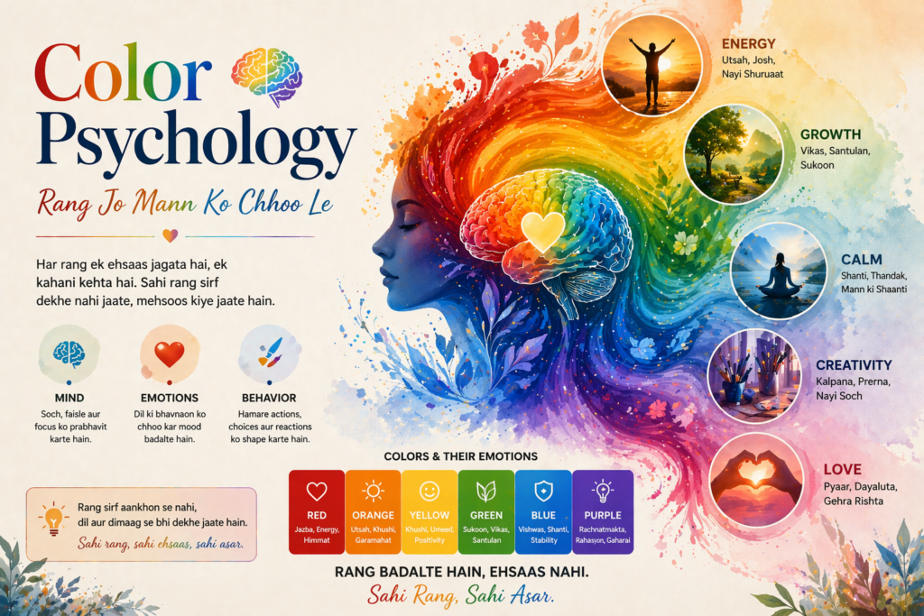
Color Basics 101 ka sabse fascinating aspect hai color psychology. Research se pata chala hai ki alag alag rang alag alag emotions aur behaviors trigger karte hain. Yeh sirf theory nahi — yeh billion-dollar companies apni branding mein use karti hain.
Lal rang urgency, passion, aur danger represent karta hai. Sale badges aksar lal hote hain. Neela rang trust, stability, aur peace ka symbol hai — Facebook, Twitter, Samsung sab neele hain. Peela rang optimism aur creativity ka rang hai — McDonald’s ka ‘M’ peela hi hai. Hara rang nature, health, aur growth se juda hai — health brands aur organic products isko prefer karti hain. Kaala rang sophistication, luxury, aur power ka rang hai — luxury brands jaise Chanel, Apple isko use karti hain.
Color Basics 101 ka yeh psychological pehlu samajhne ke baad aap kabhi bhi kisi brand ya advertisement ko pehle wali nazar se nahi dekhenge.
7. Color Basics 101 in Digital Design — Screen Par Rang
Aaj ke digital zamaane mein Color Basics 101 ka ek naya dimension hai — digital colors. Screen par rang physical rangon se alag behave karte hain.
RGB Model — Roshan Ka Jadoo
Screens RGB model use karti hain — Red, Green, Blue. Ye teen colors light ke roop mein kaam karte hain. Inhe milane se white light banti hai. Is model mein #000000 kaala hota hai aur #FFFFFF safed. Web design aur app design mein yahi model use hota hai.
CMYK Model — Print Ka Sach
Print ke liye CMYK model use hota hai — Cyan, Magenta, Yellow, Black. Yahan rangon ko milane se dark hota hai (jo screen se ulta hai). Isliye jo color screen par dikha woh print par thoda alag lag sakta hai — Color Basics 101 ka yeh ek practical lesson hai jo bahut kaam aata hai.
HEX Codes — Design Ka Secret Language
Web design mein colors ko HEX codes se represent karte hain — jaise #FF5733 ek bold orange-red hai. Ye 6 digit codes precise color specification dete hain taaki design har jagah same dikhe.
8. Color Contrast aur Accessibility — Sab Ke Liye Design
Color Basics 101 mein ek bahut zaroori topic hai accessibility. Duniya mein lagbhag 8% purush aur 0.5% striyan color blindness se prabhavit hain. Iska matlab hai ki jo colors aapko clearly dikhai dete hain, unhe woh log alag tarah dekhte hain.
Isliye professional designers contrast ratio ka dhyan rakhte hain. WCAG (Web Content Accessibility Guidelines) kehti hain ki text aur background ka contrast ratio kam se kam 4.5:1 hona chahiye. Color Basics 101 ka yeh lesson aapki design ko truly inclusive banata hai — yaani har insaan ke liye accessible.
Acchi design sirf sundar nahi hoti — woh sab ke liye accessible bhi hoti hai. Yeh Color Basics 101 ka ek core value hai.
9. Practical Tips — Aaj Se Hi Karo Apply
Theek hai, ab bahut theory ho gayi. Chaliye dekhte hain ki Color Basics 101 ke is knowledge ko aap apni life mein practically kaise use kar sakte hain:
Pehli tip: 60-30-10 ka rule follow karein. Kisi bhi design mein 60% dominant color, 30% secondary color, aur sirf 10% accent color use karein. Yeh ek surefire formula hai professional-looking design ke liye. Doosri tip: Inspiration ke liye nature dekho. Phool, pahad, sunsets — nature ka har scene ek perfectly harmonious color palette hai. Teesri tip: Free tools ka use karein — Coolors.co, Adobe Color, aur Canva jaise tools free mein color palettes suggest karte hain. Chauthi tip: Colors test zaroor karein — ek color jo aapko laptop par pasand aaya, woh mobile par ya print par alag dikh sakta hai.
10. Color Basics 101 — Aapke Career Ke Liye Kyun Zaroori?
Aap sochenge ki yeh sab sirf artists ya designers ke liye hai. Lekin sach yeh hai ki Color Basics 101 ki samajh aaj almost har field mein kaam aati hai. Bloggers aur content creators apni brand identity banane mein. Social media marketers apne posts ko eye-catching banane mein. Entrepreneurs apna logo aur website design banwane mein better decisions lene ke liye. Teachers apni presentations ko zyaada engaging banane mein. Interior designers aur gharwale ghar ko khubsurat banane mein.
Aaj jab sab kuch visual ho gaya hai — Instagram, YouTube, e-commerce, online businesses — tab Color Basics 101 ki samajh ek superpower ban jaati hai. Woh log jo rang samjhte hain, woh apni baat zyaada effectively communicate kar paate hain.
11. Common Galtiyan Jo Beginners Karte Hain
Color Basics 101 seekhte waqt kuch galtiyan bahut common hain. Ek baar inhe samajh lo to aap zyadar beginner galtiyan nahi karenge. Pehli galti: Bahut saare rang use karna — ek design mein 5 se zyaada colors confusing lagte hain. Simple raho. Doosri galti: Contrast ignore karna — light background par light text bilkul nahi parhega. Teesri galti: Context bhool jaana — ek rang jo ek culture mein lucky maana jaata hai, doosri culture mein uska matlab alag ho sakta hai. Chauthi galti: Sirf trends follow karna — trending colors ko blindly use karna brand identity nahi banata. Aapka brand ka ek consistent color language hona chahiye.
12. Conclusion — Rang Seekho, Duniya Badlo
Color Basics 101 sirf ek design concept nahi hai — yeh ek aisi language hai jo bina bolein bolti hai. Jab aap rang samajhte hain to aap zyaada effectively communicate kar sakte hain, zyaada creative bante hain, aur apne kaam ko zyaada impactful bana sakte hain.
Is article mein humne Color Basics 101 ke har zaroori pehlu ko cover kiya — rang ki definition se lekar color wheel, warm-cool colors, tints-shades-tones, color harmony, psychology, digital applications, aur practical tips tak. Yeh sab milke aapko ek solid foundation dete hain jo aap apne kisi bhi creative ya professional kaam mein use kar sakte hain.
“Rang seekhna ek din ka kaam nahi, lekin Color Basics 101 woh pehla qadam hai jiske baad aap kabhi peeche nahi dekhte.”
Toh deri kis baat ki? Aaj se hi Color Basics 101 ko apni zindagi ka hissa bana lo. Ek rang chuno, ek design banao, ek kahani likho — aur duniya ko apne rangon se roshan karo!